在2D中可视化嵌入向量
我们将使用 t-SNE 来将嵌入向量的维度从1536降低到2。一旦将嵌入向量降至两个维度,我们就可以在一个2D散点图中将它们绘制出来。数据集是在Get_embeddings_from_dataset Notebook中创建的。
1. 降低维度
我们使用 t-SNE 分解将维度降低到2维。
import pandas as pd
from sklearn.manifold import TSNE
import numpy as np
from ast import literal_eval

# 加载嵌入向量
datafile_path = "data/fine_food_reviews_with_embeddings_1k.csv"
df = pd.read_csv(datafile_path)

# 转换为浮点数的列表列表
matrix = np.array(df.embedding.apply(literal_eval).to_list())

# 创建一个t-SNE模型并转换数据
tsne = TSNE(n_components=2, perplexity=15, random_state=42, init='random', learning_rate=200)
vis_dims = tsne.fit_transform(matrix)
vis_dims.shape
(1000, 2)
2. 绘制嵌入向量
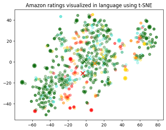
我们将每个评论根据其星级评分着色,颜色从红色到绿色变化。
即使在降维到2维时,我们仍然可以观察到数据的良好分离。
import matplotlib.pyplot as plt
import matplotlib
import numpy as np

colors = ["red", "darkorange", "gold", "turquoise", "darkgreen"]
x = [x for x,y in vis_dims]
y = [y for x,y in vis_dims]
color_indices = df.Score.values - 1

colormap = matplotlib.colors.ListedColormap(colors)
plt.scatter(x, y, c=color_indices, cmap=colormap, alpha=0.3)
for score in [0,1,2,3,4]:
    avg_x = np.array(x)[df.Score-1==score].mean()
    avg_y = np.array(y)[df.Score-1==score].mean()
    color = colors[score]
    plt.scatter(avg_x, avg_y, marker='x', color=color, s=100)

plt.title("Amazon ratings visualized in language using t-SNE")
Text(0.5, 1.0, 'Amazon ratings visualized in language using t-SNE')