Note
Go to the end to download the full example code. or to run this example in your browser via Binder
一个谱双聚类算法的演示#
这个例子演示了如何生成一个棋盘格数据集并使用 SpectralBiclustering 算法对其进行双聚类。谱双聚类算法专门设计用于通过同时考虑矩阵的行(样本)和列(特征)来对数据进行聚类。它的目标不仅是识别样本之间的模式,还包括在样本子集内识别模式,从而检测数据中的局部结构。这使得谱双聚类特别适合于特征的顺序或排列固定的数据集,例如图像、时间序列或基因组。
数据被生成,然后被打乱并传递给谱双聚类算法。然后,打乱矩阵的行和列被重新排列以绘制找到的双聚类。
# 作者:scikit-learn开发者
# SPDX许可证标识:BSD-3-Clause
生成样本数据#
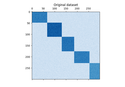
我们使用 make_checkerboard 函数生成样本数据。 shape=(300, 300) 内的每个像素用其颜色表示来自均匀分布的值。噪声从正态分布中添加,其中为 noise 选择的值是标准差。
如你所见,数据分布在 12 个集群单元中,并且相对容易区分。
from matplotlib import pyplot as plt

from sklearn.datasets import make_checkerboard

n_clusters = (4, 3)
data, rows, columns = make_checkerboard(
    shape=(300, 300), n_clusters=n_clusters, noise=10, shuffle=False, random_state=42
)

plt.matshow(data, cmap=plt.cm.Blues)
plt.title("Original dataset")
_ = plt.show()

我们打乱数据,目标是随后使用
SpectralBiclustering 进行重建。
import numpy as np

# Creating lists of shuffled row and column indices
rng = np.random.RandomState(0)
row_idx_shuffled = rng.permutation(data.shape[0])
col_idx_shuffled = rng.permutation(data.shape[1])
我们重新定义了打乱的数据并绘制了它。我们观察到我们失去了原始数据矩阵的结构。
data = data[row_idx_shuffled][:, col_idx_shuffled]

plt.matshow(data, cmap=plt.cm.Blues)
plt.title("Shuffled dataset")
_ = plt.show()

Fitting SpectralBiclustering#
我们拟合模型并比较获得的聚类与真实情况。注意,在创建模型时,我们指定了与创建数据集时相同的聚类数量( n_clusters = (4, 3) ),这将有助于获得良好的结果。
from sklearn.cluster import SpectralBiclustering
from sklearn.metrics import consensus_score

model = SpectralBiclustering(n_clusters=n_clusters, method="log", random_state=0)
model.fit(data)

# Compute the similarity of two sets of biclusters
score = consensus_score(
    model.biclusters_, (rows[:, row_idx_shuffled], columns[:, col_idx_shuffled])
)
print(f"consensus score: {score:.1f}")
consensus score: 1.0
The score is between 0 and 1, where 1 corresponds to a perfect matching. It shows the quality of the biclustering.
绘制结果#
现在,我们根据 SpectralBiclustering 模型分配的行和列标签按升序重新排列数据,并再次绘制。 row_labels_ 的范围从 0 到 3,而 column_labels_ 的范围从 0 到 2,总共表示每行 4 个簇和每列 3 个簇。
# 首先对行进行重新排序,然后对列进行重新排序。
reordered_rows = data[np.argsort(model.row_labels_)]
reordered_data = reordered_rows[:, np.argsort(model.column_labels_)]

plt.matshow(reordered_data, cmap=plt.cm.Blues)
plt.title("After biclustering; rearranged to show biclusters")
_ = plt.show()
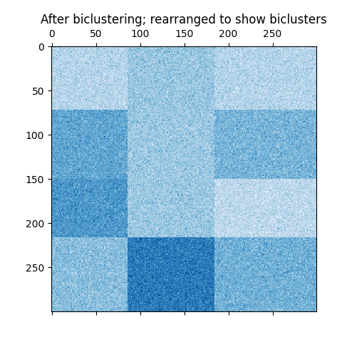
作为最后一步,我们希望展示模型分配的行标签和列标签之间的关系。因此,我们创建一个网格,使用 numpy.outer ,该函数接受排序后的 row_labels_ 和 column_labels_ ,并将每个标签加1,以确保标签从1开始而不是0,以便更好地可视化。

行标签向量和列标签向量的外积展示了一个棋盘结构的表示,其中行和列标签的不同组合由不同深浅的蓝色表示。
Total running time of the script: (0 minutes 0.379 seconds)

Related examples